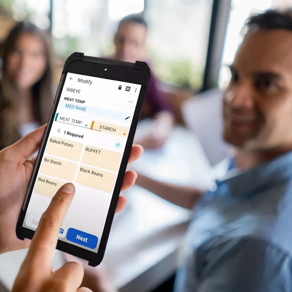
Increase participation and accuracy at self-checkout via design improvements
Convenience and fuel store operators have a challenge on their hands with an estimated 75 percent of their customers not moving beyond the fuel pump. By streamlining their forecourt, they free up valuable time to engage with their customers and convert more sales.


Get the tips you need to design easy and safe self-checkout
Even before the pandemic, shoppers around the world were heading to self-service more often—and now that’s increased dramatically. According to a U.S. survey Shekel Brainweigh conducted in April 2020, 87 percent of shoppers say they’d prefer to shop in stores with touchless or robust self-checkout options. The survey found that more than two-thirds of consumers are now using self-checkout, touchless self-checkout or frictionless micro-markets to pay for their groceries.
So, it’s not surprising that retailers are either deploying or looking to deploy more self-service options in their stores. But, simply setting up a device won’t cut it. Getting your store’s front-end design right is key to successful deployment and customer adoption.
Twenty design ideas to support the self-checkout your customers want
A new study, "Self-Checkout Loss: Increasing Participation and Scan Accuracy Through Design," from ECR Retail Loss Group, deep dives into the day-to-day experience of shoppers and store associates with self-checkout and how rethinking design can help solve some of the challenges they’re facing. It also presents twenty design ideas that can help improve the customer experience as well as scanning accuracy and helps reduce shrink.
The study was conducted by Design Against Crime Research Center, University of the Arts London who partnered with four European retailers, Asda, Carrefour, Lidl and Tesco, to understand the self-checkout experience from the perspective of shopper and self-checkout supervisors. They studied shoppers and hosts, observing their journey from entry to exit, and the design challenges and frustrations that surfaced.
Here are some of the study’s findings:
- Disorderly queues, congestion in the self-checkout area and friction at self-checkout contribute to an unpleasant and chaotic experience for hosts and shoppers. These frustrations affect customers’ actions when they use self-checkout, manifesting in mistreatment of staff and other shoppers, and contributing to mis-scans, non-scans and walkaways.
- Inconvenient and inefficient self-checkout procedures annoy shoppers and are used as justification to act in ways that contribute to retail losses.
- Hosts find it difficult to manage their self-checkout area and provide customer service and surveillance when there is extensive multitasking, especially for long periods of time.
- Self-checkout layout greatly affects hosts’ ability to manage the checkout area.
- It’s not always obvious to shoppers or hosts when the transaction is complete.
- Systems in place for hosts to report to management can be slow and not easy to use. This creates apathy and fatigue towards these procedures.
- Ad-hoc implementation encourages problem solving, but it often results in obtrusive designs which highlight lack of consideration and consistency of design language.
- Diverse shoppers have diverse needs, which must be acknowledged and addressed across the self-checkout process.
The study then presents a set of design concepts that address these challenges. Here are some of them:
Self-checkout Till Cover
A clearly visible till cover helps shoppers see which tills are out of order from a distance, rather than waiting until they approach the screen. Till covers are recommended over the use of digital signage because it’s easier for shoppers to ignore signs.
A till cover improves:
Navigation
- Helps shoppers choose a working till from afar
Efficiency
- Reduces number of tasks for hosts

Next open self-checkout
This automated sign should be displayed at the front of a self-checkout queue, directing shoppers to the next available till in order to improve customer flow. This sign would also reduce the number of tasks performed by hosts, while improving organization and giving shoppers autonomy in the queue. The sign also provides a natural and clear path from the front of the queue to the self-check-out area, reducing spillover and overcrowding in the space.
A next open till sign improves:
Communication
- Signals a call to action for shoppers
- Establishes a culture of honesty, security and support

Using icons
Using large visual icons, instead of words, improves the customer interface for users as well as hosts, who can now see the screens from further away. By showing each scanned item, staff can better monitor mis-scans and shoppers can make sure that they’ve scanned and bagged the correct item. It also helps reduce theft when clear images of scanned items are displayed. To enhance this feature, linking this data with computer vision-based product detection technology may be a good idea.
Using large icons improves:
Usability
- Easier for shoppers to know what’s been scanned
Communication
- Increases surveillance as hosts can monitor interfaces from afar

Self-checkout to go
This layout aims to avoid congestion by compartmentalizing the shop and providing self-checkout options in various areas. So, shoppers grabbing quick bites and on-the-go purchases have their own convenient self-checkout. In another section, customers may be purchasing items that require special assistance because there’s a lack of bar codes, like baked goods, loose fruits and vegetables and bulk sections with nuts, grains and cereals—with a monitoring emphasis on items that are commonly subject to theft. Concentrating “problems items” improves efficiency for shoppers and supports better monitoring by hosts.
A multiple self-checkout layout improves:
Efficiency
- Makes it speedier for shoppers to navigate the store looking for snacks or on-the-go items
- Reduces queue times as shoppers with small baskets aren’t waiting behind those with large baskets
- Improves processes in other parts of the shop

Cash vs card mats
Mats on the floor can be used to clearly indicate which self-checkouts are card only. Signage on the walls or above tills often goes unnoticed. By making use of the floor space, the information is more noticeable in an environment that often has too much signage at eye level.
Mats improve
Efficiency
- Shortens queue times and streamlines customer flow in the area
- Reduces the number of tasks for hosts
Navigation
- Shoppers can more easily find an open till.
These are just some of the design ideas in the full report. It also highlights many different factors to be considered when making design changes, including store location, store size, layout, layout of self-checkout, location of self-checkout in the store, the time of day, technology, age of shoppers, language/cultural differences, basket size, type of items, and more.
Making these design changes (and bringing crime prevention techniques to the self-checkout process) is important to provide customers with easy, safe, seamless self-checkout, whether in new store layout or existing sites.
Read the detailed report here for an in-depth view of meeting self-checkout challenges and gaining the design ideas to address them.